
Aspen Summer Words Benefit Invite Brand Identity & Website Design
Every year my client Aspen Words puts on a nationally acclaimed writing workshop (Summer Words) and it’s accompanied by a benefit fundraiser to help ensure the non-profit continues to provide an extraordinary level of programming throughout the year. For me, the annual benefit provides an opportunity to get creative and play outside the lines (a little) from their traditional brand identity. Each year the benefit’s theme is entirely different so the challenge is to create an identity unique to each event but also maintain the high level of professionalism and integrity the non-profit has worked so hard to achieve.
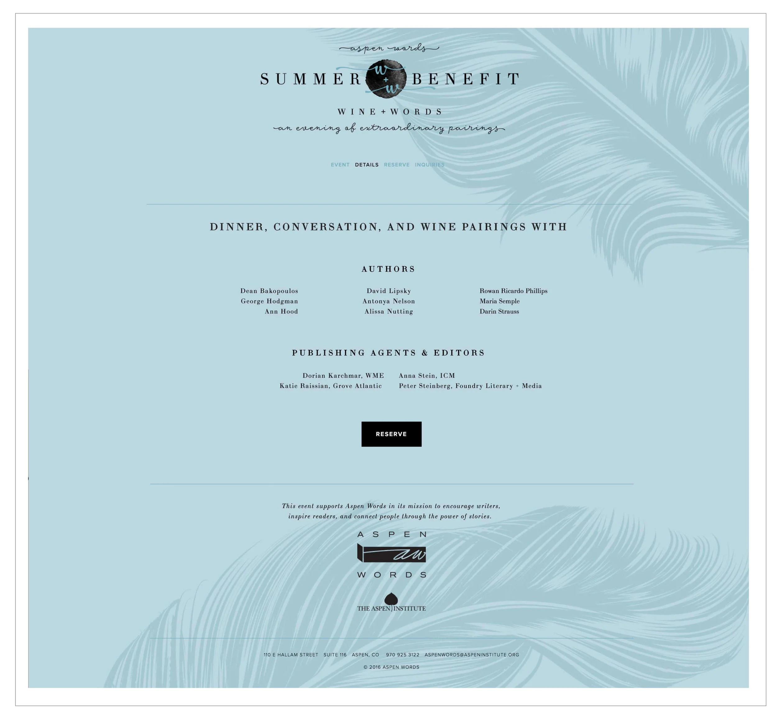
The 2016 benefit theme was “An Evening of Extraordinary Pairings” which encompassed Lucy Kalanithi in conversation with Ann Patchett as well as a wine auction that included original writing about each wine being auctioned by a famous author who was also in attendance at the event. What a night! And a lot of different parts and pieces to put together into a simple, sophisticated airy event identity.
The interview took the lead role for the evening. The interviewee - Lisa Kalanithi - is the wife of deceased author Paul Kalanithi, whose posthumously published memoir When Breath Becomes Air has been a New York Times bestseller as well as a Best Book of the Year by The Washington Post. Aspen Words loved the book jacket and hoped it would help inspire the event identity. As soon as I saw the cover, I felt a deep pull of inspiration and knew that the book would indeed be the inspiration for the event’s identity.
Along with the When Breath Becomes Air book jacket, the other influences for the identity were the concept of pairings: wine pairings, literary pairings and word pairings, to incorporate jewel tones and gold accents, possibly a feather motif to reference the literary component and to keep the feeling bright, happy and festive without being insensitive to the book’s focus.
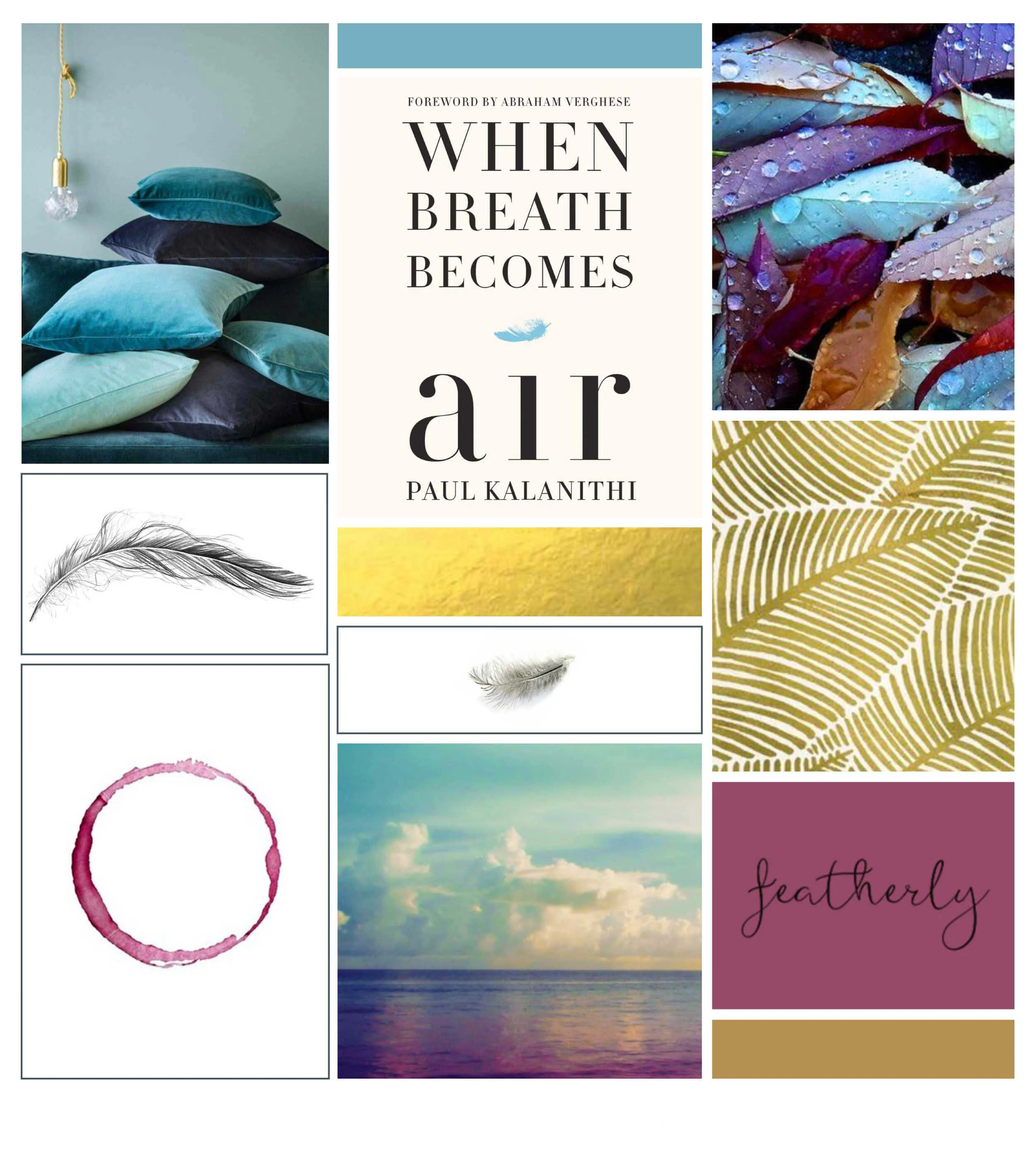
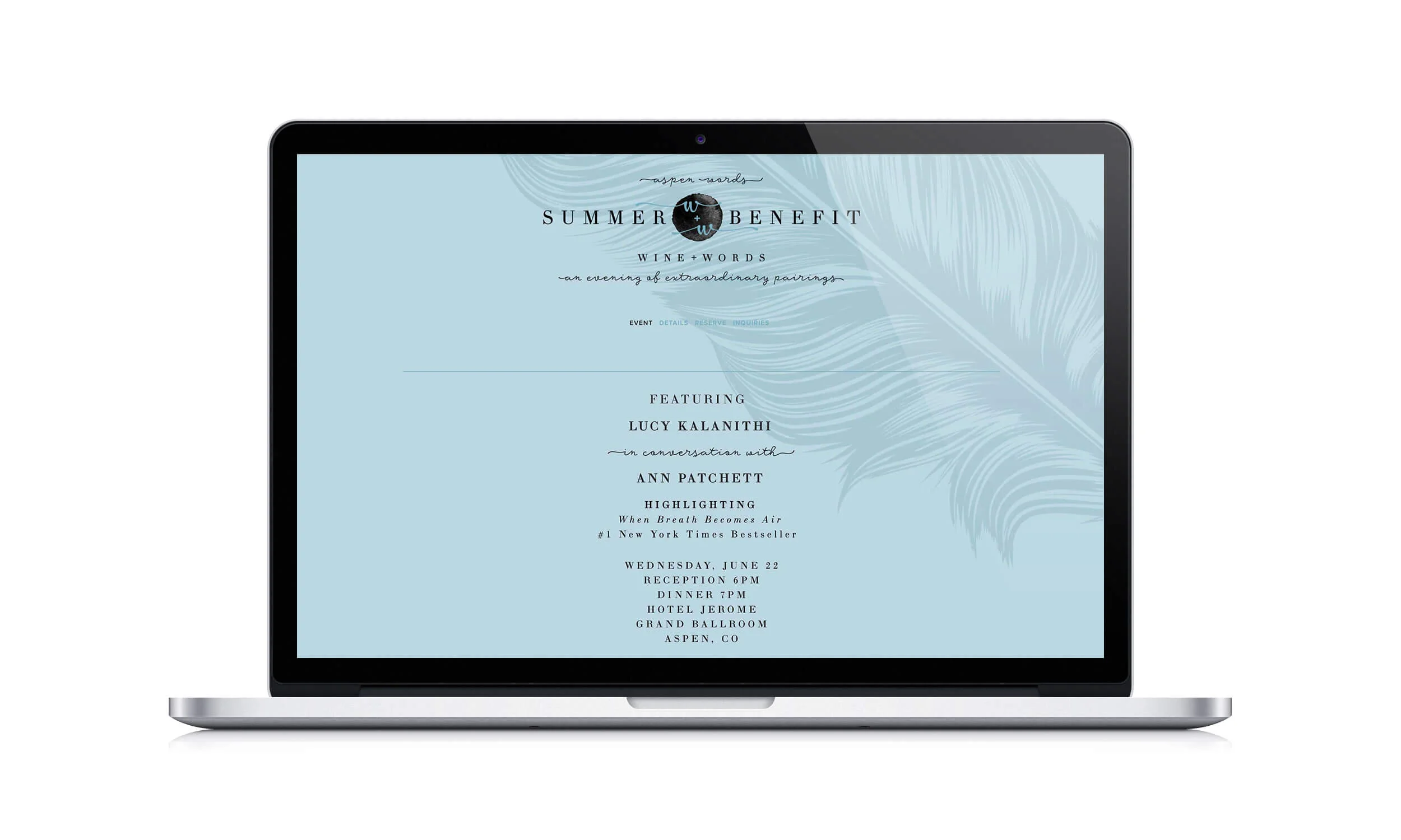
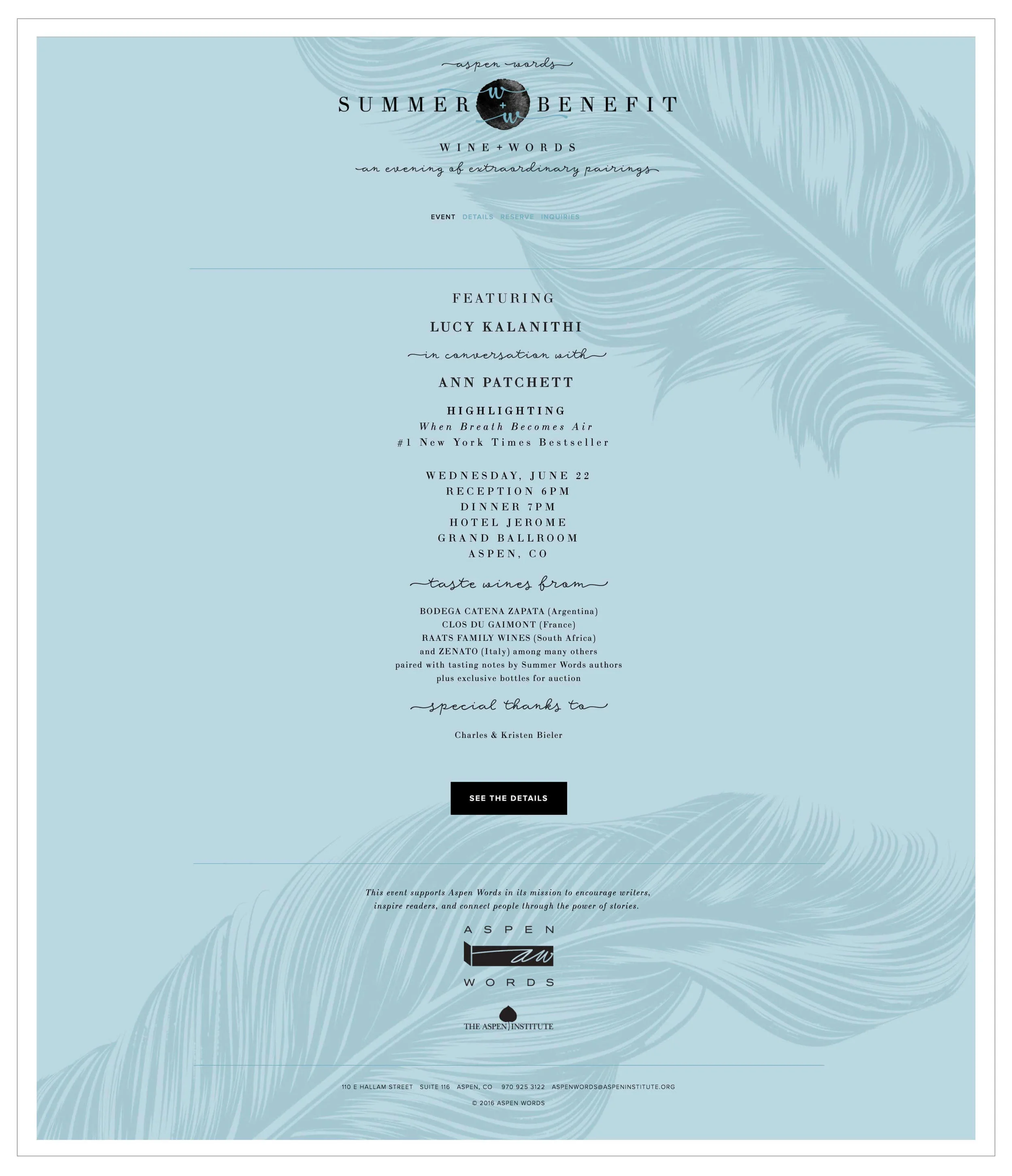
Based on the inspiration, I was able to distill an event identity that encompassed all of what Aspen Words was looking for. Since the event took place in June, I decided to focus on blue jewel tones instead of the more typical burgundies and reds in order to keep the identity in line with the summer date of the event. The blues paired with gold added the sophistication as well. To call attention to the pairings part of the event, I came up with an event headline to go with the longer title - Wine + Words. As a way to anchor the title with the event I incorporated a round watercolor drop that is reminiscent of both a drop of wine and a drop of ink. The ink drop also plays with the feather quill background. The combination of a slab serif font that reflects the book jacket with a friendly script font completes the overall feel, resulting in the simple, sophisticated, airy look that hit all the right notes for the spectacular event.
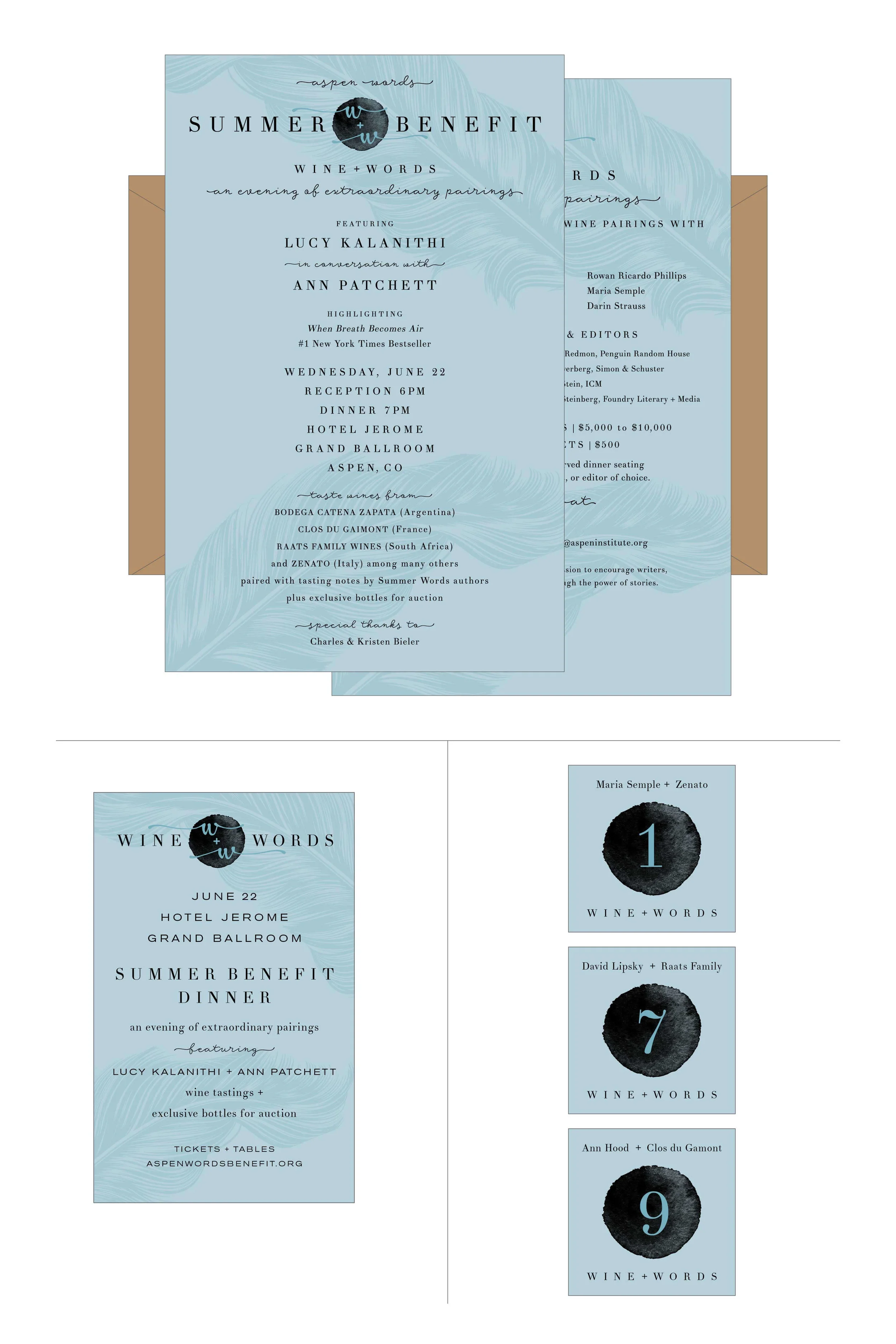
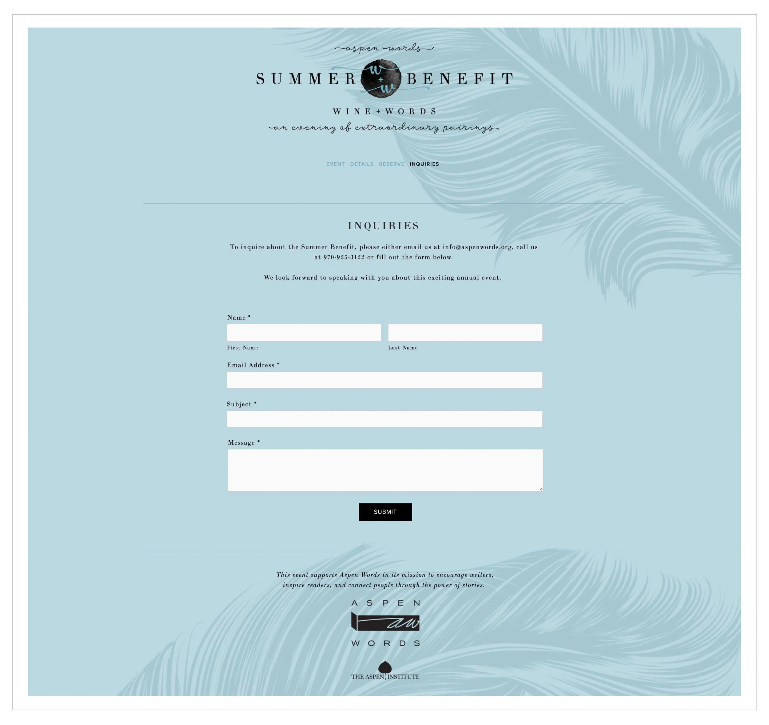
The collateral items created all had such a cohesive, beautiful look. The main collateral item was the invitation which was printed in pantone colors, ensuring precise color quality with a sophisticated aged bronze-gold color for the envelopes. The invitations definitely stood out in the recipients mail boxes. There were also table numbers and a small ad. Using the feather quill background for the conceptual website was so striking and sophisticated, really keeping the brand styling intact.

While this project may have seemed like a very tall order, I found it such a beautiful challenge and was so happy with the how everything turned out.